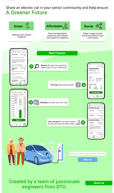
Community Drive
As part of the UX Design Prototyping course, I developed a co-driving and car-sharing concept for seniors. Using Figma, we created and tested mobile and web prototypes through iterative user testing. The project resulted in a functional prototype and a landing page that validated the concept with potential users.
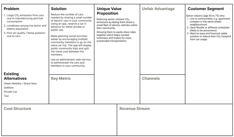
Business Model Canvas
To understand the value creation and strategic potential of Community Drive, we applied the Business Model Canvas. This tool helped us structure the concept across key areas:
Problem & Customer Segment: Identifying senior citizens as the target group and mapping their challenges, such as CO₂ emissions, loneliness, and accessibility.
Solution & Value Proposition: Defining the ride-sharing platform as a way to reduce emissions, encourage social interaction, and make transportation more sustainable.
Existing Alternatives: Benchmarking against services like Green Mobility, Share Now, and GoMore to clarify differentiation.
By working systematically through the canvas, we aligned the service concept with user needs, market alternatives, and sustainability goals, which provided a foundation for later design and prototyping.
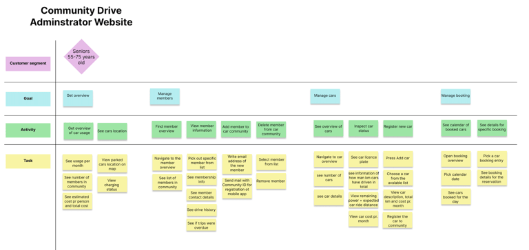
User Story Mapping
For Community Drive, we used user story mapping to structure both the smartphone app and the administrator website. We mapped the design in three layers:
Main goals: e.g. managing an account, reserving a car, or getting an overview of this week’s drives.
Activities: the broader actions required to reach each goal, such as updating information, viewing scheduled rides, or managing vehicles.
Tasks: the detailed steps users take, like entering a password, choosing a date, or confirming a reservation.
This method helped us keep the user flows clear and ensure that both the app and the website supported seniors and administrators in reaching their goals smoothly.
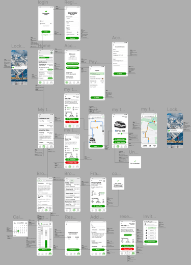
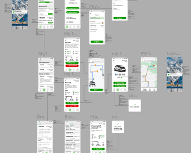
Wireframing and Micro-Interactions
We developed the wireframes in Figma, starting with low-fidelity layouts to map out navigation and functionality. As the concept evolved, we added micro-interactions to simulate real user flows — for example:
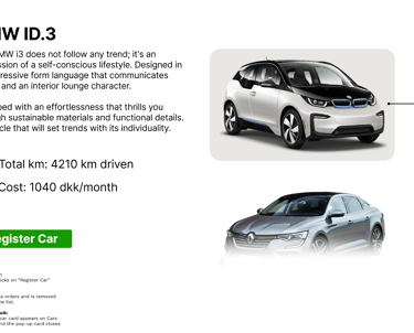
Triggers such as clicking a car card or booking button.
Feedback like hover highlights, confirmation dialogs, and updated status indicators.
Transitions between screens to demonstrate how users would move seamlessly through the interface.
This approach allowed us to quickly test usability and improve the overall interaction design before moving into higher-fidelity prototypes.

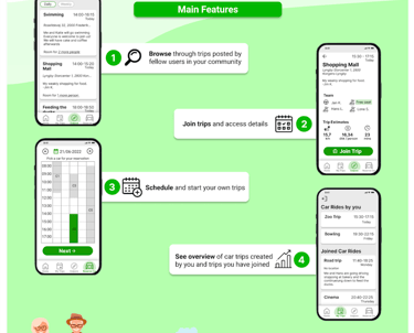
Outcome
The project resulted in a fully functioning interactive prototype built in Figma, demonstrating the app’s key features and user flows. To support the concept, we also designed a landing page that pitched the service and communicated its value proposition to potential users.